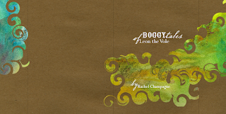

I was thinking about the cover this week. And the type. I thought the type should be expressive. More expressive than the average kid's book. I'm expecting the parent to read this, not the child, so readability is not quite as important. I'd rather readers looked at my book and enjoyed it because it was different and fun to read even if it was a bit more challenging. The story itself isn't hard to understand. And the illustrations are straight-forward. So it could use something interesting.
I like the quirkiness of Cochin. I mixed it with a script and a bold font (Rosewood Fill).
After I get some feedback on the type, etc. I'm going to work on the cover more; write a description for the back cover, a blurb for the flaps, and add all the little touches it'll need.
No comments:
Post a Comment